The thing about being an anxious perfectionist

skewed sophie.jpg

This is the problem: I am an anxious being. More importantly, I am an anxious perfectionist. I don’t know why- it might have something to do with maybe being partially OCD, or trying to control the uncontrollable, or just having the need for that one good thing. All in all, this is who I am.

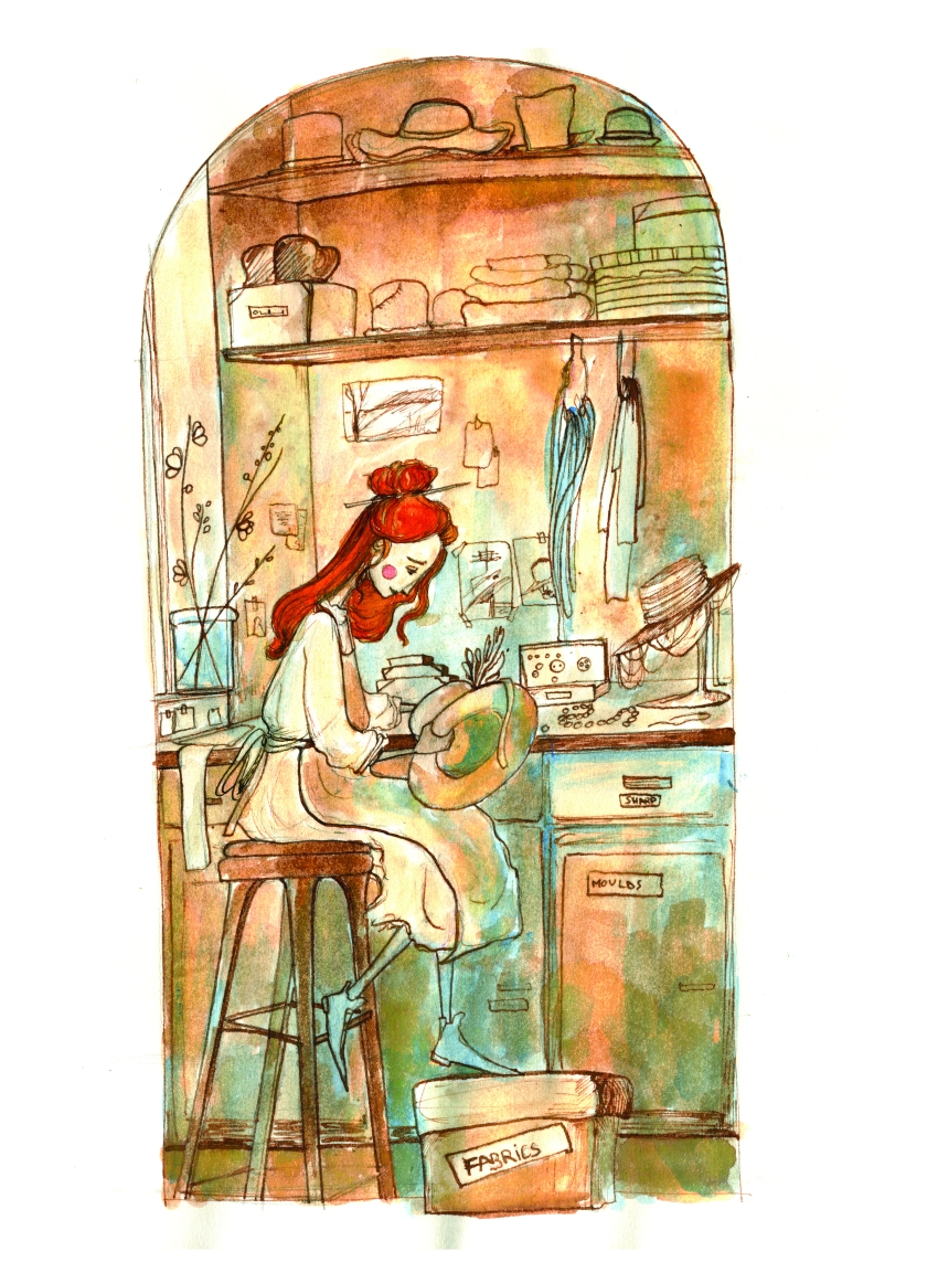
The thing is, this knowledge does not make my life any easier when illustrating. Because I don’t know if I am being realistic in my self-criticism, or delusional and controlled by the self-deprecating realisation that perfection, by definition, cannot be achieved. So as I look at the illustrations I have done so far for “Howl’s Moving Castle”, part of me wants to say is pleased and happy for some weird reason. Another part, and a bigger one at that, is mortified by this complacency and utter blindness when it comes to the work produced. Surely, there are so many things to be improved. I mean, even looking at the illustration above, I can see where shadows are missing, where more contrast was needed, where I relied too much on the ink itself to cover my own insufficiency. And yet, this image remains my favourite from the series so far. I think it’s because of the emotion I managed to capture on Sophie’s face. I put a bit of me in there. And it sort of lives, I think.

But then there are other, less successful images in my project. There is a scene where Old Sophie sees the castle on the moors for the first time. And it’s meant to be dark, bluish, and menacing. It is supposed to be an awe-inspiring scene. But all I can think of when looking at that illustration is how much I relied on Photoshop to edit on top of my incompetence. I was so afraid of using watercolour on a landscape, that I forgot to feel, and I forgot to play. And I think that is visible there. It’s a bit… amateurish.

There are other illustrations where I can find something to complain about. I feel like I am constantly a few steps back from where I should be, from a technical perspective. I am not good enough. Never. And it’s infuriating.

And then again, there are images which if I were to describe their shortcomings, would make the whole thing sound like nit-picking. There are some illustrations in the project (so far), with which I am actually almost pleased. Almost. I can’t actually be pleased because they are not good enough. And they are not perfect. And if you somehow have a doubt in your mind that I don’t have any logical grounds to sustain the above mentioned opinion, oh, believe you me, I can find plenty of plausible arguments to sustain it. It’s the problem with art. It is so damn subjective, you can see a gem in any pile of rubbish, but you can also nit-pick at a masterpiece. Apart from the greats from Art History (I mean anything before Modernism, of course). We do not touch the greats.

Nevertheless, the strange thing is… I don’t (and I am trying very hard not to) want to nit-pick at “Howl’s Moving Castle”. Yes, there is, as always room for improvement. But considering the fact that I am not good enough, it does kind of work. The images feel like the book to me. It has that weird, kooky atmosphere. It feels…like Diana Wynne Jones’ world. It also has a lot of me in it.

So I can only try to be better in the future…


Indesign…or that teacher who beats you half to death to show you the importance of life.

50evhxh

I have been working in Indesign more than any same person aged 22 should ever do, all in the span of a month. Now, it has to be mentioned that I have developed a love/hate relationship with this software.

It is truly, amazingly useful when putting together a book, but also as capricious as a famed mistress in a book which cannot possibly exist because who on earth could be that capricious -except, of course, the software called Indesign.

If anyone has ever wondered how they can learn the mysterious ways of the above mentioned, I have the answer. Just try putting together a book. Any book. But give yourself lots of time and patience, and, above all, pints of hot steamy tea. You will need it. Because most of the times, using Indesign is a very frustrating, grueling experience, that leaves you panting after a fit of rage, pointing your fists at the gods, right before the penny drops and you realise that you’ve learnt something and nevermind you gods, this is really quite fun.

As I beavered away on putting together the illustrations and text for Howl’s Moving Castle, I have learned a great many things. For example, wrap text is a really cool trick when you want the text to play around, or interact with your images. But I’ve also learned about the thousands of questions and decisions someone assembling a book has to consider. How many inches for the gutter? Should I leave more space at the bottom or the top? Am I going to write down the name of the author on every page? What about the book title or the chapter name? Do people genuinely get lost in books to the extent that they need the title/chapter written as a footer/header on every damn page? Also…what on earth is a Master page and how can I actually use it?

That last question remains unanswered, despite the multiple attempts to google it.

I also have to admit, I am a bit of a fan of all the lines and grids that help a perfectionist like me align everything.

To be fair, I haven’t discovered even a tenth of what Indesign can do, which is probably why I still have moments of rage and hatred for it. But I am sure that once I do get more fluent in using it, I will appreciate it more.

P.S. If anyone wants to baby-talk me through the whole Master page thing, I would be very grateful.

Book Worlds 101


There is more to a book than its characters.

Books are worlds onto themselves – they have laws, geography, cityscapes, weather, personality. Terry Pratchett’s Discworld books read differently from the Middle Earth of Tolkien. And so does “Howl’s Moving Castle”, despite the fact that they all belong to the fantasy genre.

I’ve realised, doing this project, just how much of a perfectionist I am. Usually, when I read, there’s this vague image forming in the back of my head, representing the words on the page. If I want to, or if the book is really good, I can focus on the image until I am actually in that world. But that always feels like a dream and the details are hard to hold on to.

Illustrating a book has proven to be quite a different experience to reading one. Because you can’t just let the images unfocused, floating at the back of your mind or even pulling you in and absorbing you into the action. I had to read the book multiple times, with a pencil in my hand, picking out facts and details while ignoring the flashing images triggered by the words. Once that was done, the scenes most relevant to what the book represents were selected, to be later translated from words to images. But before I could draw the scenes, I had an issue – what does this world look like? Where is the land of Ingary? How do these houses look like? Through which lands does the castle travel?

As a solution, I decided to draw some of the most important places featured in the book. I drew Market Chipping using reference pictures found on the internet because that is where the main character is from. I also wanted to see on the paper how the Hatter’s shop would look like, both from the outside and the inside, despite the fact that the scenes I had selected would probably not show the shop to that extent. It helped, however, to know where things were and how they looked. And because I am a perfectionist, the idea of those details being on paper relieved me of the stress of remembering where everything was meant to go.

In retrospective, I think I was a bit too focused on the behind-the-scenes working of the world of “Howl’s Moving Castle”, that I lost track of what was really important – the personality. For example, I sketched Howl’s castle from various vantage points, following as much as I could the “instructions” of the book, but I forgot to give it the menacing, foreboding air the enchanted castle is said to have had. This was an impossible structure which terrified the villagers in Market Chipping as it glided across the hills and moors. And I was most worried with it making sense…

Nevertheless, as I compare the research sketches to the few final illustrations I now have, I can say that my initial obsession with the logistics of the world has in a way allowed me to be more free with my final drawings. Because I constructed the background in my head, I managed to focus more on the scene itself (at least to a certain degree). I will probably follow the same steps in future projects, with the amendment that I will be less precious with the sketches by keeping them quick and rough.


the problem with the characters


Since the end of September, I’ve been focused on re-imagining (because it feels more like that than just illustrating) “Howl’s Moving Castle”, a book written by the late, but brilliant, Diana Wynne Jones. Most people have not read the book, but they know about the Studio Gibli animated version. It’s supposed to be my personal challenge, as much as a university project. And boy, is it challenging…

One of my biggest issues (apart from the ever present, ever crippling self doubt) was the style of the illustrations, especially when it comes to the design of the characters. Initially, my mind was filled with the images of Jim Kay version of “Howl’s Moving Castle”. What I really wished for, was that the world would contain an edition of “Howl…” treated in the same manner that Jim Kay’s “Harry Potter” is. I was pretty obsessed with that.

As a result, I thought that a semi-realistic approach was the first step to obtaining that result. The problem? I am nowhere near a Jim Kay level. My characters were stiff and did not seem to belong to the world imagined by D.W. Jones. So I panicked. I tried to avoid the characters as much as possible. The semi-realistic portraits, based on people I had met at work, lacked the technique and depth I was looking for. Calcifer’s description was so detailed, it was only one way I could picture him, and even that did not seem to go with the self-imposed style that kept failing me.

In the end, I had a moment of luck. I was watching a really captivating film called “Arrival”, when I had an Eureka! sort of moment. In the film, there was a scene where the characters were set against a background of light, making the human body seem elongated and thin – in a way it seemed quite magical. It also reminded me of my usual, go-to style, which in no way can be called semi-realistic.

So I did a few character sketches, trying to get the shapes right, all the while inching back towards my normal style. And it felt easier. More importantly, it had the right personality and it looked as though those characters could belong in a universe of magic.

A very long post later…

This is what I learned: beware of the inspiration you find in other artists. Admiring is alright, as long as it doesn’t change your goal into an imitation game.

  • the images above are taken from my sketchbook and are fairly different from the final images which can be found on my Instagram